8. Tools in benefit-risk evaluation of medicines
Tools in benefit-risk evaluation of medicines
As mentioned, the EMA is working on the improvement of benefit-risk assessment. In parallel, work is on-going on benefit-risk in the Innovative Medicines Initiative (IMI). IMI is Europe's largest public-private initiative aiming to speed up the development of better and safer medicines for patients.
Benefit-risk has been dealt with in the IMI project PROTECT (Pharmacoepidemiological Research on Outcomes of Therapeutics by a European Consortium) http://www.imi-protect.eu/ . The goal of PROTECT is to strengthen the monitoring of the benefit-risk of medicines in Europe. There is a need for this for industry, academia and regulators and these stakeholders all participate in the project.
Benefit-risk evaluation is a highly complex process. It is not easy to structure the process in a quantifiable way. It is complicated for scientific experts, and it can be even more complex for patients. Therefore, there was a need to analyse the existing tools available to support the evaluation process. PROTECT also tries to offer a set of new and original tools and methods. Visual presentations could be useful to better understand an evaluation; in particular to illustrate the process to people not familiar with the scientific details of benefit-risk evaluation.
Further illustrations are available to outline how the benefit and the risk elements are weighted (i.e., given importance) and compared (Figures 2 and 3).
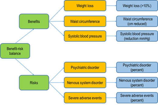
Figure 2: An example of a visual representation for a benefit-risk evaluation of the anti-obesity drug rimonabant. This method gives a clear illustration of the analytical process using a specific software (BRAT software). The orange boxes indicate what is being measured (what is relevant) and the blue boxes explain how the effects are being measured.
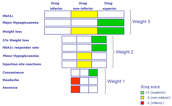
Figure 3: Another example of a visual presentation model for a benefit-risk evaluation is the tornado-like diagram. In this case, the diagram refers to a diabetes medicine. The width of the box indicates the relative importance of a criterion. The wider the box, the more important the criterion. The colours indicate the results of the scoring. Green indicates superiority, yellow indicates non-inferiority and red indicates inferiority relative to a comparator (from Sinan B. Sarac, Ph.D. thesis, Benefit-Risk Assessment in Drug Development, Technical University of Denmark, 2011 http://orbit.dtu.dk/files/9748110/Benefit_Risk_Assessment_PhD_Thesis_Sinan_B_Sarac.pdf). *(HbA1c= a form of haemoglobin measured to identify the glucose concentration over time; Hypoglycaemia= a medical emergency that involves an abnormally low blood sugar level).
The type of visualisation technique shown in Figure 3 may have some considerable advantages. In one figure, you find all the benefit-risk aspects of testing a medicine against placebo or another comparator. The various ADRs are listed down the left-hand side. They are ranked according to the seriousness of the individual ADRs, i.e. a side effect such as ‘headache’ is less serious than a case of ‘major hypoglycaemia’ (low blood sugar) therefore it is given less weight. The weighting system is reflected in the size of the boxes – more serious ADRs that are highly weighted have bigger boxes. Is the new medicine inferior (worse than the comparator), non-inferior (equal to the comparator) or superior (better than the comparator)? In a single glance, it is possible to get an overall impression of whether or not the new medicine is better than the comparator based on the placement, size and the colour of the boxes.